Themes
The Themes page (App Settings → Themes in the App Panel) controls the visual appearance of your Zango app — colours, typography, button styles, and component aesthetics. Changes here apply across the entire app frontend.
Theme List
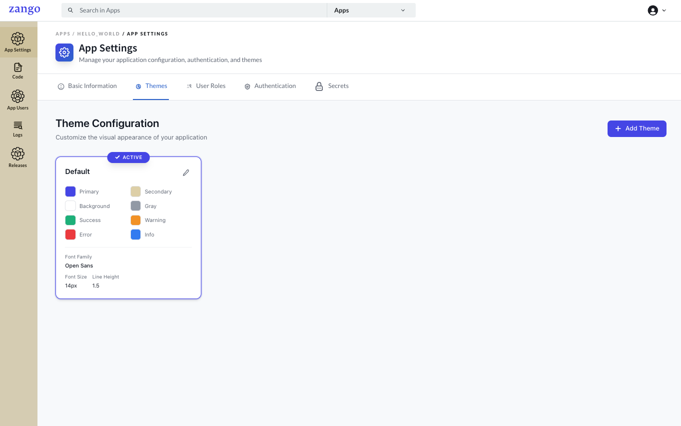
Your app ships with a Default theme that is active by default. You can create additional themes and switch between them.
Each theme configures:
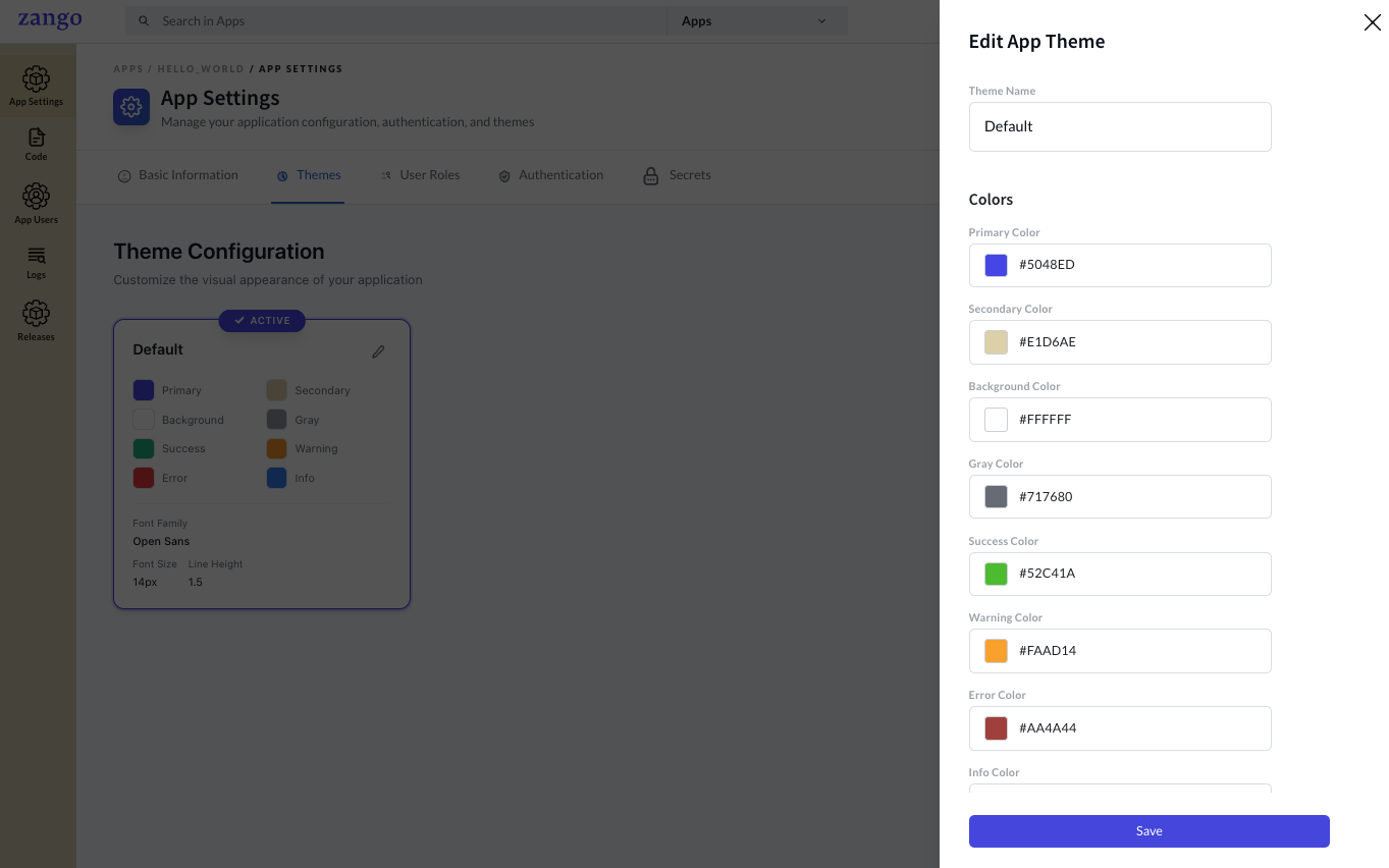
- Color Palette — Primary, Secondary, Success, Warning, Danger, Info, and Gray color slots used throughout the UI
- Typography — Font family (e.g., Open Sans, Inter) and base font size settings
Editing a Theme
Click the edit icon on any theme to open the customisation interface.
Button Styling
| Property | Default | Description |
|---|---|---|
| Button Color | #FFFFFF | Text colour of buttons |
| Button Background | #0055ED | Fill colour of primary buttons |
| Button Border Color | #CTC1D3 | Border colour |
| Button Border Radius | 4px | Corner rounding |
Typography
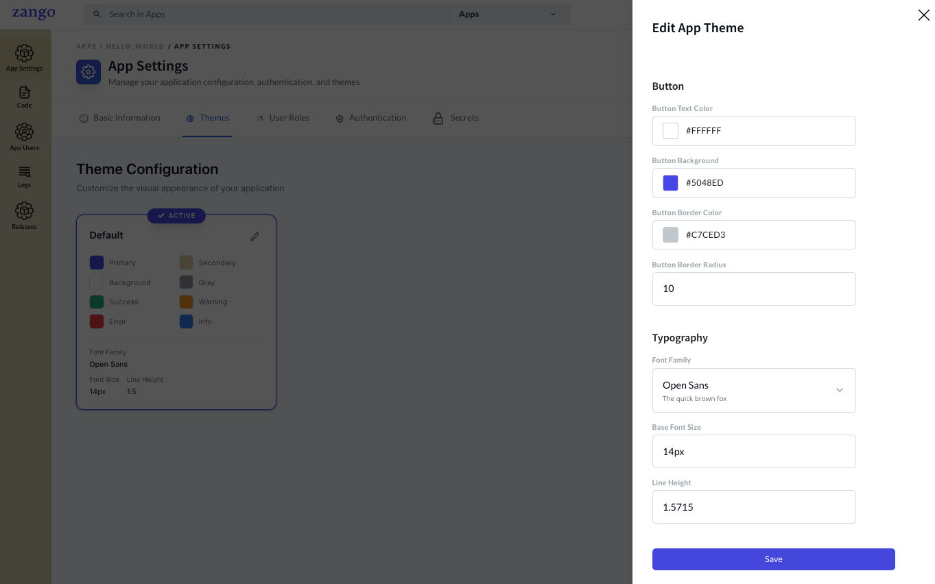
| Property | Description |
|---|---|
| Font Family | Google Font or system font name (e.g., Open Sans) |
| Base Font Size | Root rem value — affects all scaled text |
| Line Height | Global line height multiplier |
How Themes Affect the Frontend
Theme values are consumed by the Zango React frontend via CSS custom properties and the AppBuilder theme context. Components like CrudHandler, FormRenderer, WorkflowStatus, and navigation elements inherit from the active theme automatically.
To apply a custom theme in your React components:
// Theme values are available via CSS variables set by AppBuilder
// e.g., var(--color-primary), var(--font-family)